From the most recent CD cover edit i used the same image for the front cover and added the text 'daft punk' to the record as before. Instead of using the pink font for the text, I wanted to echo the banner font within the CD cover. I also used part of the banner image and made it look tattered as I did on the website. In my opinion this CD cover is a better match to the website.
For the front cover we planned to use the image I have composed and now added to the back cover. We decided against this so that our digipak would be a better match to the website.
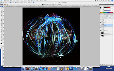
The way in which i made this image is shown below:
I took an extreme close up of Harriet's eyes, making sure i lit her well so that the colours were vibrant.
I then edited the image in Photoshop using the filter 'glowing edges' and increasing the edge width and edge brightness so that the colours appear vibrant.
I wanted to take the image blurry but because i needed clear, vibrant colours I used the motion blur filter horizontally. I then cut out the image using the magic eraser and placed it on the light drawing ball i made.
Cara.


No comments:
Post a Comment