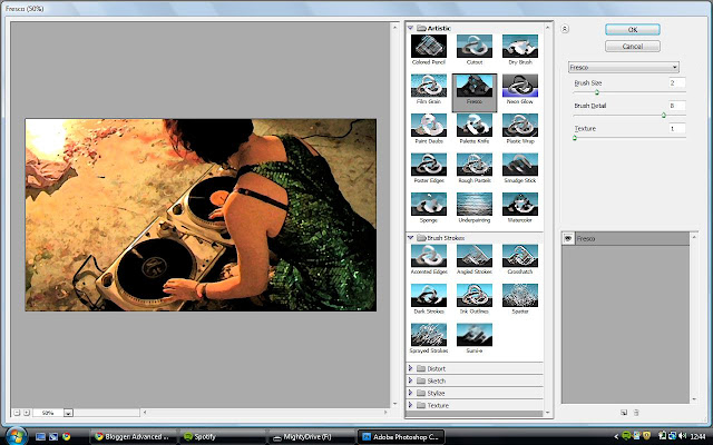
In this lesson we decided to make the layout of the website wider because there was a lot of plain black on the sides. Also, we included an image that was taken when we filmed at our first location which we then edited to look more futuristic.
Above is the original image taken.

Photoshop was used to edit the image. Firstly I applied a filter called 'Fresco' which made the picture appear to have an outline and look graphically drawn.
The next step was to adjust the colour balance, which I did by increasing the amount of blue and cyan using the sliders.
The final edited version is above.
I then used photos I took of a crystal pyramid as thumbnails for links to other pages that would be on the website but we will not create.
Cara.


No comments:
Post a Comment